Digital Media Portfolio
Painterly Effects with Brushes
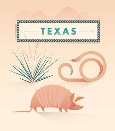
Through Adobe Illustrator, we followed a tutorial to learn exactly how to improve a poster, making it appear as it does above. For the project, we used different brushes to give the animals some texture. Additionally, we had to add the border around the text box with the word "Texas" in in. Although I worked with brushes plenty of times before doing this project, it was another experience to work with different brushes in other ways. It was fairly easy, and successful in my opinion.
Through Adobe Illustrator, we followed a tutorial to learn exactly how to improve a poster, making it appear as it does above. For the project, we used different brushes to give the animals some texture. Additionally, we had to add the border around the text box with the word "Texas" in in. Although I worked with brushes plenty of times before doing this project, it was another experience to work with different brushes in other ways. It was fairly easy, and successful in my opinion.
Create a Logo
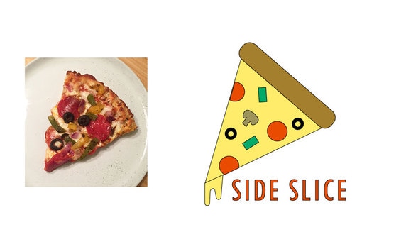
Through Adobe Illustrator CC, we were instructed to create a logo for a pizza place. We based our logo off of a photo of an actual piece of pizza. In this project, I worked a lot with shapes. With the shapes, I learned how to copy them, cut them, change their shape, etc. Over all, this project gave a valuable lesson on shapes, selecting all or separate pieces at once, etc. The most challenging part of this project was getting started and adding the dripping cheese. However, I figured it out and I think it looks fine. I had fun making the other add-ons on the pizza, such as the pepperoni and mushrooms. I enjoyed this project.
Through Adobe Illustrator CC, we were instructed to create a logo for a pizza place. We based our logo off of a photo of an actual piece of pizza. In this project, I worked a lot with shapes. With the shapes, I learned how to copy them, cut them, change their shape, etc. Over all, this project gave a valuable lesson on shapes, selecting all or separate pieces at once, etc. The most challenging part of this project was getting started and adding the dripping cheese. However, I figured it out and I think it looks fine. I had fun making the other add-ons on the pizza, such as the pepperoni and mushrooms. I enjoyed this project.
|
|
Motivational Poster (Before/After Peer Corrections)
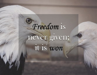
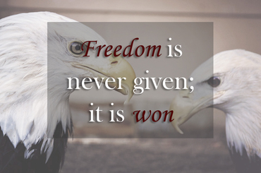
In the beginning of the semester we were instructed to create a motivational poster using Photoshop. The one I made first is on the left, while my critiqued and peer evaluated image is on the left. I first found what quote I wanted to use and the image. I then used the image as the background and worked with the saturation and other color effects for the image. Additionally, I added a large box into the middle of the image. I made the color of the box grey then worked with the opacity to make it see-through yet still visible. To finish, I added the quote. picking a font that I thought would look well. I changed the color of the text for the words "freedom" and "won" to emphasize the main topics of the quote. Honestly, I liked my unedited version better, but my peers wanted it fixed to how I touched it up. It was still a fun project to work on.
In the beginning of the semester we were instructed to create a motivational poster using Photoshop. The one I made first is on the left, while my critiqued and peer evaluated image is on the left. I first found what quote I wanted to use and the image. I then used the image as the background and worked with the saturation and other color effects for the image. Additionally, I added a large box into the middle of the image. I made the color of the box grey then worked with the opacity to make it see-through yet still visible. To finish, I added the quote. picking a font that I thought would look well. I changed the color of the text for the words "freedom" and "won" to emphasize the main topics of the quote. Honestly, I liked my unedited version better, but my peers wanted it fixed to how I touched it up. It was still a fun project to work on.
Select and Color Mask
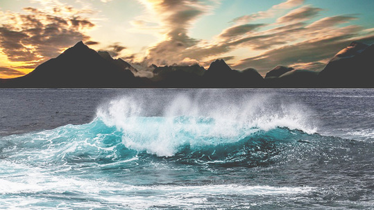
I'd have to say that this was my worst work. However, it was one of my first projects and one of the first times I worked with the masking tool. I tried masking the images of waves onto a mountainous background. If I were to make the image better, I would've made sure to get more of the wave's splashes into the image I put with the mountains to make it not such a harsh line of two noticeably different looking images, making it look more natural. Additionally, I'd work with the colors of the image with the waves, making them darker because that image is a lot brighter than the mountain background, also making it look unnatural. I don't really like this project but it was a first step to improving my masking skills.
I'd have to say that this was my worst work. However, it was one of my first projects and one of the first times I worked with the masking tool. I tried masking the images of waves onto a mountainous background. If I were to make the image better, I would've made sure to get more of the wave's splashes into the image I put with the mountains to make it not such a harsh line of two noticeably different looking images, making it look more natural. Additionally, I'd work with the colors of the image with the waves, making them darker because that image is a lot brighter than the mountain background, also making it look unnatural. I don't really like this project but it was a first step to improving my masking skills.
Online Advertisement
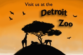
This is also one of my favorite projects. As we were only gave instructions to create an online advertisement, I decided to base my advertisement off of the Detroit Zoo. I mainly worked with brushes again and the normally basic paint brush where you draw free handedly. To make the fading colors from a light orange to darker orange is where I faded it on my own with the normal brush, which was my favorite part to do. The rest was made with the other brushes I had downloaded to Photoshop. Also on the text "Detroit Zoo" I used an effect to made the text curve and have a shadow. I liked how it all turned out.
This is also one of my favorite projects. As we were only gave instructions to create an online advertisement, I decided to base my advertisement off of the Detroit Zoo. I mainly worked with brushes again and the normally basic paint brush where you draw free handedly. To make the fading colors from a light orange to darker orange is where I faded it on my own with the normal brush, which was my favorite part to do. The rest was made with the other brushes I had downloaded to Photoshop. Also on the text "Detroit Zoo" I used an effect to made the text curve and have a shadow. I liked how it all turned out.
Website Banner
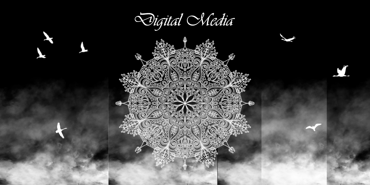
This was my most favorite creation besides my magazine cover. Doing it from scratch, I was able to make it completely how I wanted it. Again, I worked with different brushes, making up everything on the design besides the text that says "digital media." My favorite part was making the foggy-looking effect at the bottom. I also love the look of mandalas so I incorporated one into the banner. In order to make it less empty-looking, I added birds with a brush as well. I liked creating this banner.
This was my most favorite creation besides my magazine cover. Doing it from scratch, I was able to make it completely how I wanted it. Again, I worked with different brushes, making up everything on the design besides the text that says "digital media." My favorite part was making the foggy-looking effect at the bottom. I also love the look of mandalas so I incorporated one into the banner. In order to make it less empty-looking, I added birds with a brush as well. I liked creating this banner.
Flag Creation
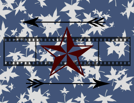
For this project, we were instructed to create a personal flag. I didn't really make this creation to represent me in any way, but rather put together different designs that I liked. I started by picking a background color that went well with the "brush" tool I used to make the white leaves in the background, which is my favorite part of the flag. I then went through the "shapes" tool, selecting the rest of the images on the flag, picking colors to make it look appealing. I also worked with the opacity option, making the film-looking tool semi-see through. This was the first time I realized there was more than the ordinary shapes so this project taught me that there's way more shapes to use than I had thought.
For this project, we were instructed to create a personal flag. I didn't really make this creation to represent me in any way, but rather put together different designs that I liked. I started by picking a background color that went well with the "brush" tool I used to make the white leaves in the background, which is my favorite part of the flag. I then went through the "shapes" tool, selecting the rest of the images on the flag, picking colors to make it look appealing. I also worked with the opacity option, making the film-looking tool semi-see through. This was the first time I realized there was more than the ordinary shapes so this project taught me that there's way more shapes to use than I had thought.
Blending and Color Effects
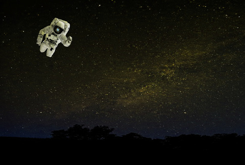
Here, we were instructed to incorporate one picture into another through Adobe Photoshop. I picked a star-filled background and masked an astronaut from another image and dragged it into the picture. I then worked with different color effects such as the saturation making the images looked like they were originally put together. This really helped me on my masking abilities while teaching me how to work with different images and colors while making them work well together.
Here, we were instructed to incorporate one picture into another through Adobe Photoshop. I picked a star-filled background and masked an astronaut from another image and dragged it into the picture. I then worked with different color effects such as the saturation making the images looked like they were originally put together. This really helped me on my masking abilities while teaching me how to work with different images and colors while making them work well together.
Experimenting with Brushes
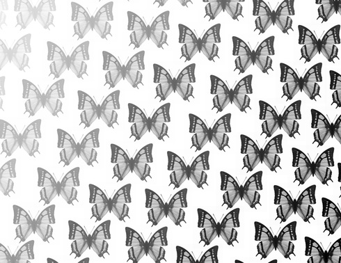
From a brush website, I was able to download free brushed onto Photoshop to use on projects. I came up with this design while experimenting with my new brushes, choosing my favorite butterfly brush. I chose different shades from white to black, using different in between shades to show a fading color. Although extremely easy, this project was still fun to work on and turned out well.
From a brush website, I was able to download free brushed onto Photoshop to use on projects. I came up with this design while experimenting with my new brushes, choosing my favorite butterfly brush. I chose different shades from white to black, using different in between shades to show a fading color. Although extremely easy, this project was still fun to work on and turned out well.
Magazine Cover
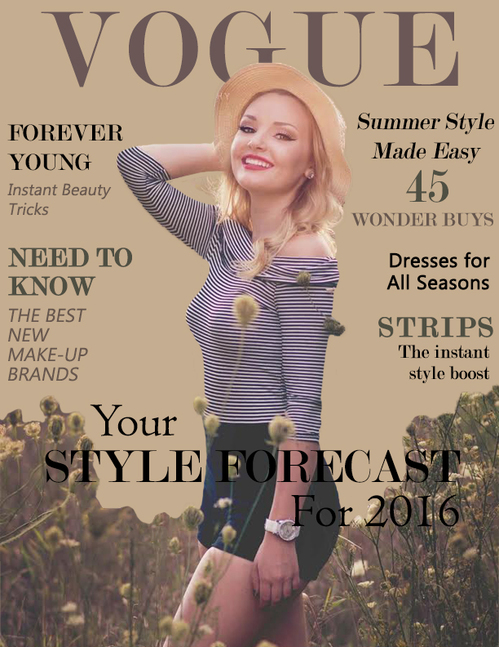
This was by far my favorite project yet. We were instructed to create a magazine cover through photoshop with ourselves on it. I first masked over myself on my senior picture and dragged it over top of a fitting background color. From there, I found a font that looked the most like the original "Vogue Magazine" title. I then picked colors that fit well with my picture, adding captions that made it more so look like a real magazine. If I were to make one change to this product, I would blend the edges of the flowers/weeds in with the solid background,making it look more natural. However while reflecting over the final piece, I believe it was pretty successful.
This was by far my favorite project yet. We were instructed to create a magazine cover through photoshop with ourselves on it. I first masked over myself on my senior picture and dragged it over top of a fitting background color. From there, I found a font that looked the most like the original "Vogue Magazine" title. I then picked colors that fit well with my picture, adding captions that made it more so look like a real magazine. If I were to make one change to this product, I would blend the edges of the flowers/weeds in with the solid background,making it look more natural. However while reflecting over the final piece, I believe it was pretty successful.
Codecademy
Throughout many tutorials on Codecademy, I was able to get the hang of how to code as I learned what it was. I had never experienced coding before and found it rather confusing at the beginning. However, once I got the hand of it, it was fairly easier and not too bad to work on. Although I took no interest in coding, it was still a valuable experience!
Throughout many tutorials on Codecademy, I was able to get the hang of how to code as I learned what it was. I had never experienced coding before and found it rather confusing at the beginning. However, once I got the hand of it, it was fairly easier and not too bad to work on. Although I took no interest in coding, it was still a valuable experience!
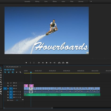
Adobe Premiere - Hoverboard Video
These past 2 weeks was my first time being introduced to Adobe Premiere, as well as actually using it. When we first started, I was overwhelmed with all the different kinds of gadgets the program offered. Learning how to use it was difficult but soon enough, I figured it out and now have the hang of it. In our video of hover boards, we cropped the videos, added audio, moved some of the videos around, added text and titles, and effects such as transitions and changing the color. Over all, I really enjoy this program and wouldn't mind working with it more!
These past 2 weeks was my first time being introduced to Adobe Premiere, as well as actually using it. When we first started, I was overwhelmed with all the different kinds of gadgets the program offered. Learning how to use it was difficult but soon enough, I figured it out and now have the hang of it. In our video of hover boards, we cropped the videos, added audio, moved some of the videos around, added text and titles, and effects such as transitions and changing the color. Over all, I really enjoy this program and wouldn't mind working with it more!
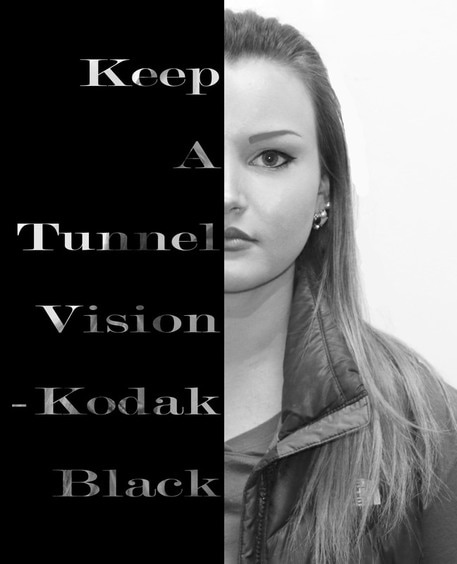
Self Poster
For this project, we had to start with a picture of ourselves, and a quote. We then used Photoshop to make the project. At first I messed around with the colors, making the picture black and white. Then, I added a black box on one half of the picture. After, I added a text box in over top of the black box and added my quote, aligning the text to the right side of the box. After, we made the text so that you can see the background behind the black box. I enjoyed this project ad how it turned out, as it taught me more about the tools Photoshop offers!
For this project, we had to start with a picture of ourselves, and a quote. We then used Photoshop to make the project. At first I messed around with the colors, making the picture black and white. Then, I added a black box on one half of the picture. After, I added a text box in over top of the black box and added my quote, aligning the text to the right side of the box. After, we made the text so that you can see the background behind the black box. I enjoyed this project ad how it turned out, as it taught me more about the tools Photoshop offers!
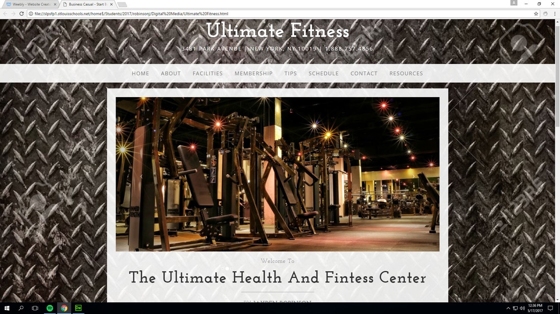
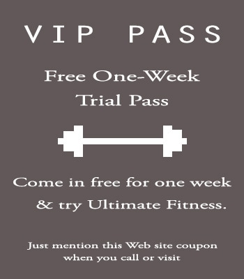
Ultimate Fitness
Making the Ultimate Fitness Website was definitely the most challenging, time consuming project yet this year. However, because all the work I had to put into it, it's also the project I'm the most proud of. To complete the website, we had to create and complete around 10 different web pages that were all linked together on Dreamweaver, coding everything. For most of the pages, I had to find images that worked well with the background and also add text talking about the information needed for that page. On pages such as the schedule, we also had to work with tables. Additionally, we had to create passes on Photoshop, save them as a jpg, then put them into our websites. Making the completed website took around 2-3 weeks and was a lot of work but it payed off when the final product looked pretty successful.
Making the Ultimate Fitness Website was definitely the most challenging, time consuming project yet this year. However, because all the work I had to put into it, it's also the project I'm the most proud of. To complete the website, we had to create and complete around 10 different web pages that were all linked together on Dreamweaver, coding everything. For most of the pages, I had to find images that worked well with the background and also add text talking about the information needed for that page. On pages such as the schedule, we also had to work with tables. Additionally, we had to create passes on Photoshop, save them as a jpg, then put them into our websites. Making the completed website took around 2-3 weeks and was a lot of work but it payed off when the final product looked pretty successful.
HTML/CSS
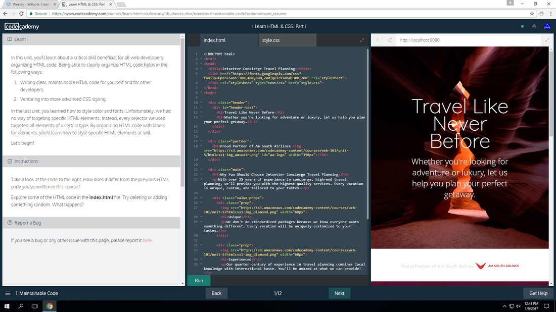
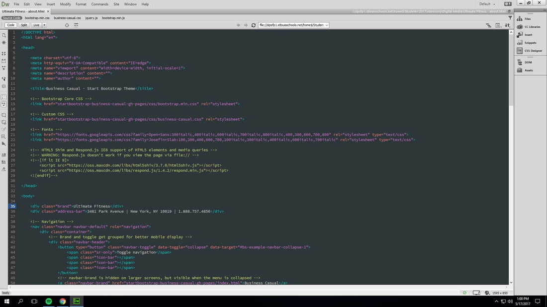
HTML and CSS is used through Adobe Dreamweaver. It's a bunch of coding to create a web page, and what we used to make our Ultimate Fitness websites. The CSS deals with the design and color of the web page while HTML is all the information put onto the page. Above is an example of HTML. Although extremely confusing at first, I'm very familiar with these things now!
HTML and CSS is used through Adobe Dreamweaver. It's a bunch of coding to create a web page, and what we used to make our Ultimate Fitness websites. The CSS deals with the design and color of the web page while HTML is all the information put onto the page. Above is an example of HTML. Although extremely confusing at first, I'm very familiar with these things now!
